Exhibit 99.1
| | |
For Immediate Release | | |
| | | SANKYO COMPANY, LIMITED |
| | | DAIICHI PHARMACEUTICAL CO., LTD. |
Brand Mark of DAIICHI SANKYO COMPANY, LIMITED
Tokyo, August 31, 2005 – SANKYO COMPANY, LIMITED. (Headquarters: Tokyo; President: Takashi Shoda) and DAIICHI PHARMACEUTICAL CO., LTD. (Headquarters: Tokyo; President: Kiyoshi Morita) announced today that the both companies have created the Brand Mark of DAIICHI SANKYO COMPANY, LIMITED (hereinafter referred to as “DAIICHI SANKYO”), which is the joint holding company to be established on September 28, 2005. The both companies are currently working toward the establishment of DAIICHI SANKYO and the complete integration in April 2007.
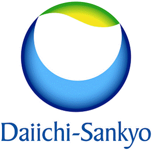
The Brand Mark aims to express Corporate Philosophy of DAIICHI SANKYO Group such as:
| | • | | Providing solutions for unmet medical needs of patients and healthcare professionals globally |
Our mission is the consistent provision of innovative pharmaceuticals to meet the medical needs of people all over the globe.
| | • | | High ethical standards as a member of the social welfare system |
As a life sciences company we play an important role in the social welfare system. In that spirit we will maintain high ethical standards, transparent management and efficient use of limited resources.
Development Concept:
The company aims to leap forward and become a Japan-Based Global Pharma Innovator.
Design:
The overall spherical shape represents the beauty of the Earth, which gives the viewer a sense of the splendor and mysteries of life. The gentle movement evoked in the upper part of the logo is meant to express supple intelligence and creativity, while the solid arc of the lower part represents reliability and a sense of mission, and the white space that appears as if it is being held within two hands stands for the vibrancy of life and, at the same time, the importance and dearness of life.
Brand Color:
The shade of blue chosen for the logo represents the trust, sense of mission and sense of responsibility that the pharmaceutical company has cultivated, while the gradation from yellow to green expresses the vitality of life and, at the same time, represents the creativity of the company’s proprietary research activities.
Use of corporate name in logo:
The corporate name is written in capital and lower-case letters to express the broadmindedness and benevolence as well as the warmth of the corporate group.
The Brand Mark was designed by Mr. Mitsuo Hosokawa of Hosokawa Design Office, a design firm which deals with numerous corporate design systems.
Contact:
| | |
|
SANKYO COMPANY, LIMITED. |
| | | Corporate Communications Department |
| | | 3-5-1 Nihonbashi Honcho, Chuo-ku, Tokyo, Japan 103-8426 |
| | | TEL:81-3-5255-7034 |
|
DAIICHI PHARMACEUTICAL CO., LTD. |
| | | Corporate Communications Department |
| | | 3-14-10 Nihonbashi, Chuo-ku, Tokyo, Japan 103-8234 |
| | | TEL:81-3-3273-7107 |