Exhibit 15.1
2023 mid-year letter — The long game
Decades of data show a stubborn trend: Recessions take months, or years, to reveal themselves. With no reason to think this time is different, we continue to protect the downside while optimizing for opportunity.

“There is an enormous pressure in the investment business to deliver good news. Trust me. Good news sells better, stockbrokers thrive on it. Investment houses thrive on it. To go out there in a bubble and talk about badly overpriced markets and downside risks is an invitation to get fired. They simply don't want to hear it…”
- Jeremy Grantham on Charlie Rose, March 11, 2013. Grantham is a renowned value investor who famously lost half of his investor base after refusing to buy into the tech bubble of the late ‘90s but was ultimately proven correct when NASDAQ fell by nearly 80%.
Today, once again, there are two prevailing theories for what is happening in the economy. The first, and more common, goes something like this:
While rising interest rates have slowed things a bit, the economy is generally healthy and more resilient than many expected, and ultimately inflation is coming down, so eventually the Fed will begin lowering rates, and we will see either a soft landing or potentially a mild slowdown… but actually things are overall pretty good.
The second theory — our stated opinion — goes more like this:
The effects of rising rates have yet to really start impacting things. It’s not that the economy is strong so much as it just takes a long time for these things to play out. The current period of seemingly little impact has created a false sense of confidence, and, like a dam that is structurally flawed, the pressure is building slowly, but most will not realize anything is wrong until that final tipping point when the pressure ultimately becomes too great, and the dam breaks.
As usual, our belief here stems not from any ability to see into the future, but simply from fundamental analysis of how similar patterns have repeated and played out in the past.
To highlight this fact, we’ve put together a series of graphs to demonstrate visually the interplay between rising rates and economic downturns over the past 70+ years.
To begin, let's look back at the last major recession, the 2008 Great Financial Crisis. Even for those who experienced the run up of the early 2000s that ultimately ended with the collapse of the financial system, the events of that time period appear compressed. The truth of course is that they were not.
Then, as now, there was a long lag between the cause and effect. And that delay misled markets. As far back as 2004, the Fed began raising interest rates from a low of 1% to the peak of 5.25%, which occurred in the summer of 2006. From that point of peak interest rates, it took roughly another 18 months before the official start of the recession in January 2008.
Of course, few, if any, knew that we were actually in a recession, even at that point. In fact, the stock market was still near its historic highs, and it took roughly another 12 months before the stock market reached its bottom in February 2009 — down more than 50% — a full 2.5 years after interest rates had peaked.
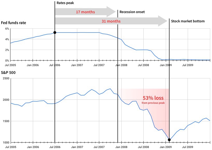
Fed Funds rate and recession dates sourced from Federal Reserve Economic Data (FRED). S&P 500 real (inflation adjusted) historical values sourced from MacroTrends.
Of course, one data point does not a trend make, so let’s look at the late ‘70s and early ‘80s, the last time we experienced runaway inflation and arguably the period closest in kind to our current circumstances.
Then, in an effort to combat resurfacing inflation, Fed Chairman Paul Volcker famously raised rates from 10% in mid-1980 to a peak of 19% by early 1981. However, it took roughly another 9 months before the recession began in summer 1981, and another full year after that point before the stock market reached its bottom in the summer of 1982, having once again fallen more than 30%.
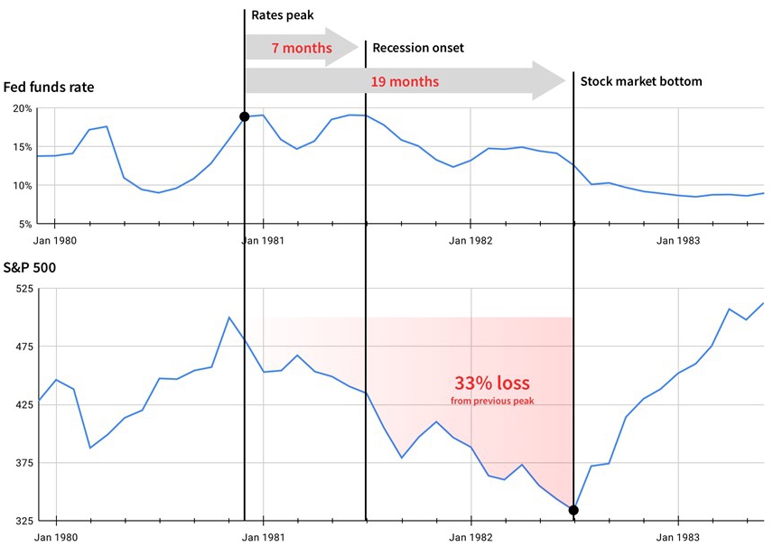
Fed Funds rate and recession dates sourced from Federal Reserve Economic Data (FRED). S&P 500 real (inflation adjusted) historical values sourced from MacroTrends.
In fact, in going through the data, we see that this phenomenon of a long lag between interest rate hikes and the start of a recession has occurred in every recession going all the way back to 1954, the start of Federal Reserve data. And importantly there’s been a similar lag in each period between reaching the peak interest rate, the start of the recession, and the bottom of the stock market.
In other words, despite the oft-repeated refrain from many pundits, the stock market is in fact a lagging — NOT a leading — indicator of recessions.
Date of peak interest rate | Lag from peak interest rate to
recession | Lag from peak
interest rate to stock market
bottom | Total decline in
stock market from
peak to trough |
| May 1969 | 8 months Dec 1969 | 13 months June 1970 | -39% decline, peak to trough |
| July 1973 | 5 months Nov 1973 | 14 months Sept 1974 | -55% decline, peak to trough |
| Dec 1980 | 7 months July 1981 | 19 months July 1982 | -33% decline, peak to trough |
| March 1989 | 16 months July 1990 | 19 months Oct 1990 | -30% decline, peak to trough |
| June 2000 | 9 months March 2001 | 27 months Sept 2002 | -49% decline, peak to trough |
| July 2006 | 17 months Dec 2007 | 31 months Feb 2009 | -53% decline, peak to trough |
| Average | 10 months average lag | 21 months average lag | -43% average decline, peak to trough |
All figures in the above table are approximate and based on publicly available data. Interest rate and recession data are from FRED. Stock market data is based upon S&P 500.
So what does this mean for investors today?
Fed Chairman Powell has recently made clear to the market that he intends to continue with at least one, if not several, additional rate hikes this year (the most recent Q1 GDP data likely only furthers his resolve on this point).
If we take the Fed's own forecast, rates will peak in December of this year. Assuming the average lag times from previous recessions, this would mean the recession would not actually begin until October of 2024, while the stock market would not reach its bottom until the Fall of 2025, with a roughly 30-40% decline from where it stands today. Although it could happen sooner, the point is that the lag is much longer than most people recognize.
Between now and then, history suggests we may experience what we might call a FOMO trap as the stock market delivers a series of rallies and subsequent dips (much as we’ve seen recently) as it stair steps its way down to an eventual floor, like it has in every recession going back to the 1950s.
Forecast date of peak interest rate | Potential date of recession | Potential date of stock market bottom | Potential stock
market decline from
all time high |
| Dec 2023 | Nov 2024 | Aug 2025 | -43% |
| Based on FOMC projections | Based on 11 month average lag from peak interest rate to recession | Based on 21 month average lag from peak interest rate to stock market bottom | Based on historical average decline from all time highs during a recession |
Portfolio performance
This belief that a very real and potentially significant downturn still lies ahead has necessarily been the foundation for all our decisions across the portfolio over the past six months.
As we discussed both at the beginning of the year and again in our Q1 letter, we have focused our efforts simultaneously on defensive preparation, continuing to build what we believe to be an extremely resilient portfolio, while also taking advantage of the growing number of opportunities created by further distress in the markets. In fact, since the beginning of the year we have acquired or invested in more than $400 million of real estate assets.
In other words, we are aiming to simultaneously protect against a more severe downside while putting investors in the position to take advantage of current and future buying opportunities as the downturn continues to unfold.
As expected, we’ve continued to shift a larger and larger percentage of efforts (and investors’ portfolios) towards income-focused investments and our income-focused funds (i.e., those that invest primarily in private credit and other forms of debt), which have performed remarkably well so far. Case in point, our largest income-focused fund, the Income Interval Fund, has paid an approximate 8% annualized distribution through the first six months of the year.
As we’ve covered recently, we see a once in a decade opportunity for private credit investments that has arisen out of what we’ve termed “The Great Deleveraging” and accordingly anticipate allocating a greater percentage of new dollars invested onto the platform towards those strategies.
Meanwhile, despite the growing headwinds brought on by further interest rate hikes, our equity-focused funds, such as the Flagship Fund, continue to hold up better than most of the broader public market real estate benchmarks when compared over the past 12+ months. (Important to note that the Flagship Fund, as well as several of the other equity-focused funds, did see net negative returns for the 2nd quarter.)
As most of our investors understand, the value of a cash-flowing real estate asset, like an apartment building or industrial warehouse, is primarily derived from two key inputs: (i) The net income stream produced from the property (think revenue from rents, minus operating expenses); and (ii) The market discount rate, or, in other words, the rate of return someone would want to earn on that income stream. In real estate this is called the cap rate (think P/E ratio in stocks).
Cap rates (and market discount rates) are inextricably linked to interest rates. As the latter rises or falls, so does the former. As a result, property values can move significantly in connection with changes in interest rates, despite the income stream from those properties remaining constant.
This phenomenon is what has been occurring across all asset types, including all real estate and consequently the Fundrise portfolio, for the past 12+ months. As interest rates have risen, we have continuously increased the cap rates that we are using to determine the values of the properties within the portfolio, which in turn has had the impact of lowering total returns (all else being equal).
For those investors who appreciate this level of detail, it’s worth noting that as of the end of Q2, we believe that the cap rates we are concluding to are in line with or, in some instances, higher than the implied cap rates of the public REITs, which have generally been trading at roughly 20% below their peaks from earlier last year.
How then has our portfolio managed to perform better than many of these REITs? Primarily because of the types of assets that the portfolio is concentrated in, along with seeing continued actual income growth at the properties themselves.
Specifically, the portfolio is almost entirely weighted to residential and industrial properties located in the Sunbelt region, which have proven to be the most resilient asset types within the broader real estate industry and are continuing to see increasing rents.
Notably, we also do not have a single high-rise office asset in the entire portfolio, having shunned the asset class for nearly the entirety of the history of the company.
Looking ahead
Despite what some may now believe after the past 15 years, markets don’t always go up. And as sure as night follows day, economic downturns have followed every major period of monetary tightening since World War II. And we cannot today see how this time is poised to be any different.
In fact, the aforementioned Jeremy Grantham also noted that “Of the 33 [bubbles] that have ended, every one broke all the way back — not halfway back — to the trend before the bubble started.”
But analysis, of course, is not actually the difficult part. While the data exists for all of us to see, it’s human nature that makes following through on this insight so challenging; the ability to maintain the long view in the face of all the headlines and social media touting a rising stock market. In truth it is FOMO, or the lack thereof, that separates the great investors from the herd over the long run.
The bottom line is that in this environment the potential risks on the downside far outweigh any near term missed upside that may come from a surprisingly soft landing. As managers, it is therefore our job to do what is necessary to prepare and position our investors to be as well protected as possible ahead of a coming recession.
We recognize that not all of our investors may agree with this conclusion. And some may choose to redeem their investments in the hopes of catching the current wave (or potentially falling knife). While we are skeptical of such a move and fearful of the potential risks associated with it, we also understand that not everyone may agree with our outlook and, in fact, we hope that in this instance we are proven to be wrong.
Meanwhile, to those tortoises who choose to play the long game with us, we say, as always:
Onward.
Appendices
Exhibit A: H1 2023 returns of client accounts by individual Fundrise sponsored fund
| Fund name / objective | | Average AUM1 | | | Launch date | | Net total return2 | |
| Registered funds |
| Flagship Real Estate Fund | | $ | 1,416,506,625 | | | Jan 2021 | | | -1.91 | % |
| Income Real Estate Fund | | $ | 551,300,734 | | | Apr 2022 | | | 3.34 | % |
| Growth | | | | | | | | | | |
| Growth eREIT | | $ | 260,418,545 | | | Feb 2016 | | | 0.06 | % |
| Growth eREIT II | | $ | 167,361,234 | | | Sep 2018 | | | -4.93 | % |
| Development eREIT | | $ | 133,376,658 | | | Jun 2019 | | | -2.30 | % |
| eFund | | $ | 100,784,420 | | | Jun 2017 | | | -0.06 | % |
| Growth eREIT III | | $ | 65,722,251 | | | Feb 2019 | | | -4.57 | % |
| Growth eREIT VII | | $ | 86,312,731 | | | Jan 2021 | | | -2.04 | % |
| Balanced |
| East Coast eREIT | | $ | 172,479,231 | | | Oct 2016 | | | -0.71 | % |
| Heartland eREIT | | $ | 97,483,051 | | | Oct 2016 | | | -1.93 | % |
| West Coast eREIT | | $ | 91,712,790 | | | Oct 2016 | | | 0.85 | % |
| Balanced eREIT II | | $ | 56,947,530 | | | Jan 2021 | | | -1.87 | % |
Exhibit B: H1 2023 returns of client accounts by account objective
| Plan objective | | Income | | | Balanced | | | Growth | | | Overall | |
| Dividends | | | 1.96 | % | | | 0.96 | % | | | 0.60 | % | | | 0.99 | % |
| Appreciation | | | -1.30 | % | | | -1.86 | % | | | -2.12 | % | | | -1.87 | % |
| Net Total Return3 | | | 0.65 | % | | | -0.90 | % | | | -1.53 | % | | | -0.88 | % |
1 “Average AUM” is the daily average invested capital in the indicated program during the period indicated, calculated using the Modified Dietz method. The average capital calculation weights individual cash flows (for example investments or redemptions) by the length of time between those cash flows until the end of the period. Flows which occur towards the beginning of the period have a higher weight than flows occurring towards the end.
2 “Net total return” consists of the time-weighted, weighted-average aggregate returns of Fundrise Advisors client accounts within the fund indicated, calculated using the Modified Dietz method. Net total returns are inclusive of dividends and capital gains / losses, are net of fees, and include shares which were acquired via dividend reinvestment.
3 “Net Total Return” consists of the time-weighted, weighted-average aggregate returns of Fundrise Advisors client accounts within the funds with the stated fund objective during the period indicated, calculated using the Modified Dietz method. Net total returns are inclusive of dividends and capital gains / losses, are net of fees, and include shares which were acquired via dividend reinvestment. Net total returns do not include investments in the Fundrise Opportunity Fund, Innovation Fund and Opportunistic Credit Fund.